Red Devil wrote:don't compromise. sure, seek input, but don't let people derail you completely.
Whenever i look at your Uler work, i am always impressed.
btw, i like the first one best.
Don’t worry, it’s still going to be 90%+ my re-interpretation. Much like an author writes the first draft for them self and then edits for their audience, I’m trying to follow that too. Though technically I guess I haven’t really finished my first draft, so there’s still stuff yet to see that’ll make the community’s eyes bleed – either in joy or horror.
That’s another thing that makes me wonder why mods don’t get finished. Beyond time, resources, and commitment, I’ve often wondered if too many modders aren’t showing their work too soon. Then either they get critiques or criticism, and then start second-guessing every decision they make, and before long they just drop the whole project. Just a thought…
All who've replied to the previous screenshot wrote:And I guess anyone else who sees this and is interested.
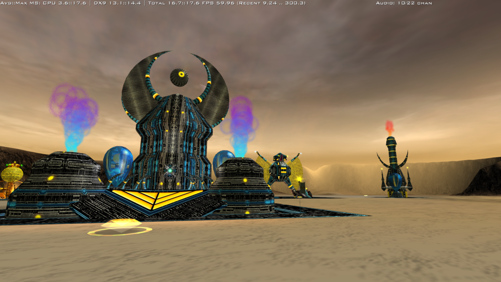
I still tend to favor the color/detail style in the first image (which is really more like the fourth version), but I can also understand if there are those that like the second better. Granted, while the ISDF textures did have some detail in the orange parts, my version probably did go too far.
As for the orange and grey, well as I mentioned earlier it’s been difficult to find the right “average” orange. I’ve gone through at least 5 different ones of my own, including a similar version of the one in the second picture. It works though and may be a closer to the “stock” version. I definitely like the lighter grey better though. Since everything is made out of bio-METAL, I tend to think of most (not all) metals as being a brighter, and felt that the lighter grey followed that. Plus it gave better contrast to the details in the surface. But I neither love nor hate the darker grey, so I’ll try to keep going with that one.
I’ve also been reworking some of the Scion ones. The stock textures are too muted, too muddy, but again, I’m willing to knock back my version a little closer to them, just not all the way.
DeusExCeteri wrote: on your comments
What, you don’t like my flapping, yellow chicken wings? I’m outraged! How dare you! Just kidd’n.

I’ve been very iffy on them long before I created this thread. I wanted to try and give both some bulk and some animation to the Matriarch since it doesn’t have side buildings like the ISDF recycler, but I guess it’s time to admit they’re just not cutting it and will need to cut them.
Though, the puffed up lizard comparison, actually seems like more of a defense for keeping them.

Thanks for your alternate idea, excellent thumbnail by the way. I can’t say for certain I will use it, but I’ll definitely take a closer look at it when I get back to the Matriarch model.
- - - - - - - - - -
Which brings me to my next issue, I’ve been finding lots of things that’ll need fixes (Why is the Archer over there while its collision box is over here?), plus reworking the textures again, plus implementing better MP textures, making it work with VSR, then going through more rigorous play testing as a .pak package … so I suspect my release month will slip yet again … but it will come out in 2015! … most likely … maybe … dear lord I hope so …