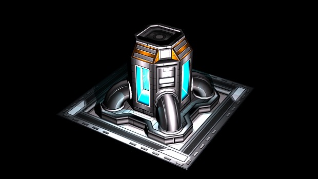
The overall metal colour is a little too monotone, try overlaying a few photoshourced metals over it and place some edge wear on the panelling edges, will add much more realitic look, if you going to use so many draw calls and fill up GPU memory with large textures..may as well make the most of it
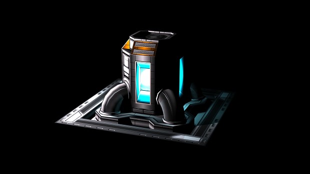
That said, I liked your QF2 units, it seems they were nice and dark, which was easier on the eyes.
So yes, that is my critque, and purely that.